Modern Contractor Website Design: What Works in 2026
Modern Contractor Website Design: What Works in 2026
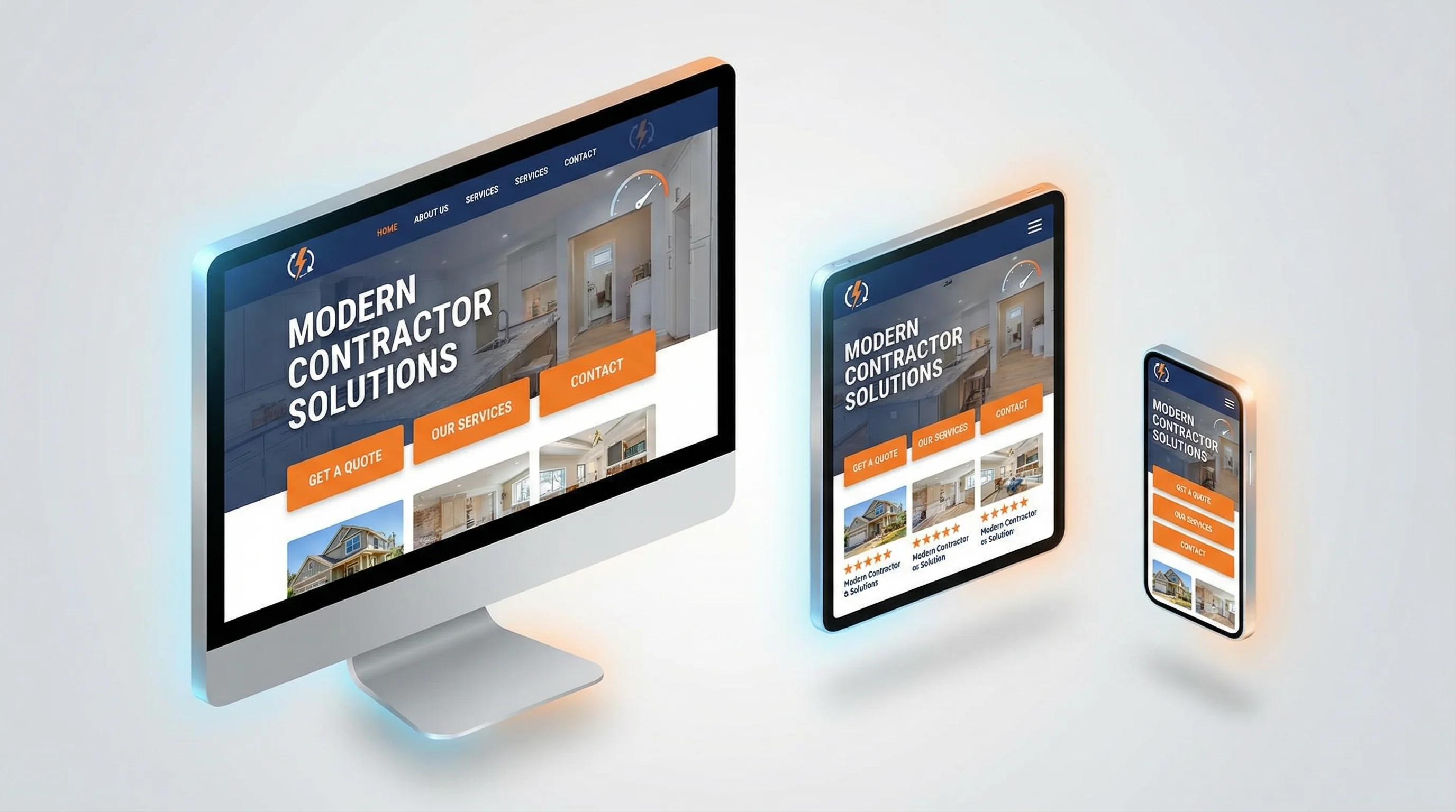
TL;DR: Modern contractor websites in 2026 prioritize speed, mobile-first design, trust signals, and conversion optimization over flashy animations. The winning formula includes bold headlines, prominent CTAs, real photos/videos, social proof above the fold, fast load times (under 2.5 seconds), and clear service area pages. Design trends that work: clean layouts, high contrast, large text, sticky navigation, and video backgrounds. Trends that do not work: stock photos, generic messaging, slow load times, and hidden contact info. For comprehensive local SEO strategies to drive traffic to your new website, see our Local SEO for Contractors guide.
What Makes a Contractor Website "Modern" in 2026?
A modern contractor website is not about looking trendy—it is about converting visitors into booked jobs.
The best contractor websites in 2026 share these characteristics:
- Fast (load in under 2.5 seconds)
- Mobile-first (60-70% of traffic is mobile)
- Trust-building (real photos, reviews, credentials)
- Conversion-focused (multiple CTAs, easy booking)
- SEO-optimized (schema markup, service area pages)
If your site does not check these boxes, you are losing leads to competitors who do.
The Anatomy of a High-Converting Contractor Website
1. Hero Section (The First 3 Seconds)
What it must include:
- Clear headline that states exactly what you do and where you serve
- Subheadline that highlights your unique value (credentials, speed, guarantees)
- Prominent CTA (call button + "Book Online" button)
- Trust signals (star rating, years in business, licenses)
- Real photo or video (your team, your trucks, your work)
Example:
Headline: "Same-Day HVAC Repair in Fresno | Licensed, Insured, 4.9 Stars"
Subheadline: "20+ Years Experience | We Answer in 60 Seconds | $0 Down Financing Available"
CTAs: [Call Now: 559-521-3122] [Book Online]
Trust: ⭐⭐⭐⭐⭐ 247 Google Reviews | Inc. 5000 Company
Visual: Photo of your lead tech in front of a service truck
Why it works: Visitors decide in 3 seconds whether to stay or leave. This hero section answers their key questions immediately: What do you do? Where do you serve? Can I trust you? How do I contact you?
2. Sticky Navigation (Always Accessible)
What it must include:
- Logo (links back to homepage)
- Main navigation (Services, About, Blog, Contact)
- Phone number (large, clickable)
- CTA button ("Book Online" or "Get Free Estimate")
Why it works: As visitors scroll, they should always be able to call you or book an appointment. Sticky navigation ensures your contact info never disappears.
Pro tip: On mobile, use a sticky call button at the bottom of the screen (always visible, easy to tap).
3. Social Proof Section (Build Trust Fast)
What it must include:
- Star rating and review count (4.9 stars from 247 Google Reviews)
- Customer testimonials (with photos and full names)
- Video testimonials (even smartphone quality works)
- Trust badges (BBB, Angi, HomeAdvisor, manufacturer certifications)
Where to place it: Immediately after the hero section (above the fold if possible).
Why it works: Homeowners do not know you. Social proof = instant credibility.
Pro tip: Use real photos of customers (with permission). Stock photos kill trust.
4. Services Section (Clear & Scannable)
What it must include:
- Icons or images for each service (HVAC repair, installation, maintenance)
- Short descriptions (2-3 sentences max)
- "Learn More" links to dedicated service pages
- CTA buttons ("Get a Free Estimate" or "Book Now")
Why it works: Visitors scan, they do not read. Icons + short descriptions make it easy to find what they need.
Pro tip: Prioritize your highest-margin services at the top (replacements, installations) over low-margin services (tune-ups, inspections).
5. About Section (Prove Expertise)
What it must include:
- Founder story (why you started the business, your contractor background)
- Team photos (real people, not stock photos)
- Credentials (licenses, certifications, years in business)
- Unique differentiators (what makes you different from competitors)
Why it works: Homeowners want to know who will show up at their house. A personal story + real photos build trust.
Example:
"Hi, I am Aaron Husak, founder of Sequoia GEO. I spent 20+ years as a licensed contractor (B General, C-20 HVAC, C-36 Plumbing), scaling my HVAC/Plumbing business to 130+ employees and Inc. 5000 recognition. Now I help contractors like you turn searches into booked jobs."
6. Service Area Section (Local SEO)
What it must include:
- List of cities you serve (Fresno, Clovis, Madera, Sanger, etc.)
- Embedded Google Map showing your service area
- Links to dedicated city pages (for SEO)
Why it works: Google prioritizes local relevance. If you serve multiple cities but only mention your home base, you are invisible to searchers in surrounding areas.
Pro tip: Create dedicated landing pages for each city (e.g., "HVAC Repair in Clovis") with unique content.
7. FAQ Section (Answer Objections)
What it must include:
- Common questions (pricing, availability, service areas, financing, credentials)
- Clear, honest answers (no vague corporate speak)
- Schema markup (so Google can display answers in search results)
Why it works: Every unanswered question is a reason to leave your site and check a competitor.
Example questions:
- "How much does HVAC repair cost?" (Give a range)
- "Do you offer emergency service?" (Yes, 24/7)
- "Are you licensed and insured?" (Yes, here are our credentials)
- "Do you offer financing?" (Yes, multiple options)
8. Final CTA Section (Last Chance to Convert)
What it must include:
- Bold headline ("Ready to Get Started?")
- Subheadline (reinforce value: "Same-Day Service | $0 Down Financing | 4.9 Stars")
- Multiple CTAs (call button, "Book Online" button, contact form)
Why it works: Not everyone converts on the first scroll. A final CTA gives them one more chance to take action.
Design Trends That Work in 2026
✅ Bold, High-Contrast Colors
What it looks like: Dark navy or black backgrounds with bright orange, green, or red CTAs.
Why it works: High contrast makes CTAs impossible to miss.
Example: Black hero section + bright orange "Call Now" button.
✅ Large, Readable Text
What it looks like: Minimum 18px body text, 36px+ headlines.
Why it works: Mobile users need large text to read without zooming.
✅ Real Photos & Videos (Not Stock)
What it looks like: Photos of your team, your trucks, your projects. Videos of you explaining your process.
Why it works: Stock photos scream "generic contractor." Real photos build trust.
✅ Video Backgrounds
What it looks like: Short looping video in the hero section (your team at work, before/after projects).
Why it works: Video grabs attention and builds credibility faster than text.
Pro tip: Keep videos under 10 seconds, muted by default, and optimized for fast loading.
✅ Sticky CTAs (Always Visible)
What it looks like: Call button or "Book Online" button that stays visible as users scroll.
Why it works: Reduces friction—users can convert anytime without scrolling back up.
✅ Minimalist Layouts (Less is More)
What it looks like: Clean, uncluttered design with plenty of white space.
Why it works: Reduces cognitive load, making it easier for visitors to focus on your message and CTAs.
Design Trends That Do NOT Work in 2026
❌ Stock Photos
Why it fails: Homeowners can spot stock photos instantly. They signal "generic contractor" and kill trust.
Fix: Use real photos of your team, trucks, and projects.
❌ Slow Load Times
Why it fails: 53% of mobile users abandon sites that take longer than 3 seconds to load.
Fix: Optimize images, minimize JavaScript, use a CDN.
❌ Hidden Contact Info
Why it fails: If visitors have to hunt for your phone number, they will leave.
Fix: Put your phone number in the header, hero section, and sticky navigation.
❌ Generic Messaging
Why it fails: "Quality Service Since 1995" tells visitors nothing. Every contractor says that.
Fix: Be specific. "Same-Day HVAC Repair | We Answer in 60 Seconds | $0 Down Financing."
❌ Auto-Playing Music or Videos (With Sound)
Why it fails: Annoying and unprofessional. Visitors will leave immediately.
Fix: If you use video, mute it by default and let users unmute if they want.
❌ Too Many Popups
Why it fails: Aggressive popups (especially on mobile) frustrate users and hurt SEO.
Fix: Use exit-intent popups only, or trigger popups after 30+ seconds on the page.
Mobile-First Design (Non-Negotiable in 2026)
Why it matters: 60-70% of contractor website traffic is mobile. If your mobile experience sucks, you lose the majority of your leads.
Mobile-first checklist:
✅ Responsive design (adapts to all screen sizes)
✅ Large tap targets (buttons at least 44x44 pixels)
✅ Readable text (minimum 16px body text)
✅ Fast load times (under 2.5 seconds)
✅ Click-to-call buttons (no manual dialing)
✅ Sticky call button (always visible at bottom of screen)
✅ No horizontal scrolling or pinch-to-zoom required
Test: Open your site on your phone right now. Is it easy to use? If not, fix it immediately.
Speed Optimization (Critical for SEO & Conversions)
Why it matters: Google penalizes slow sites in search rankings. More importantly, 53% of mobile users abandon sites that take longer than 3 seconds to load.
How to optimize:
- Compress images (use WebP format, lazy loading)
- Minimize JavaScript and CSS (remove unused code)
- Use a CDN (Cloudflare, AWS CloudFront)
- Choose fast hosting (avoid cheap shared hosting)
- Enable browser caching
Tool: Run your site through Google PageSpeed Insights and fix the red flags.
Target: Aim for a Largest Contentful Paint (LCP) under 2.5 seconds.
The Bottom Line
Modern contractor website design is not about following trends—it is about converting visitors into booked jobs.
The winning formula:
- Fast load times (under 2.5 seconds)
- Mobile-first design (large text, easy navigation, click-to-call)
- Trust signals (real photos, reviews, credentials)
- Clear CTAs (multiple options, always visible)
- Local SEO (service area pages, schema markup)
If your website checks these boxes, you will outperform 90% of your competitors.
Ready to audit your website? Go through this checklist and identify your biggest weaknesses. Then fix them one by one, starting with speed and mobile optimization.
Ready to Build a Modern, High-Converting Contractor Website?
At Sequoia GEO, we specialize in building contractor websites that turn visitors into booked jobs. From mobile-first design to speed optimization and conversion testing, we handle the details so you can focus on growing your business.
Let's talk about your website goals. Schedule a free consultation today.
Related Articles
10 Must-Have Website Features for Contractors in 2026
In 2026, contractor websites must go beyond looking good—they need to convert visitors into booked jobs.
Website Conversion Secrets: Turn More Visitors Into Booked Jobs
Most contractor websites get traffic but fail to convert. Learn 12 proven tactics to double your lead generation.
HVAC GEO: How to Engineer Your Air Conditioning Business for the AI Era
How AI is changing HVAC marketing. GEO strategies to stay visible in ChatGPT, Google AI Overviews & voice search.'Google Search' era is ending. If your HVAC business isn't built to answer the complex questions homeowners are asking AI, you aren't just losing clicks—you're being erased. Learn the four pillars of HVAC GEO.
Ready to Grow Your Contractor Business?
Let's apply these strategies to your business. Get a free analysis of your current marketing and a custom growth plan.