Website Conversion Secrets: Turn More Visitors Into Booked Jobs
Website Conversion Secrets: Turn More Visitors Into Booked Jobs
TL;DR: Most contractor websites get traffic but fail to convert visitors into booked jobs. The secret is not more traffic—it is removing friction, building trust fast, and making it ridiculously easy to take the next step. This guide covers 12 proven conversion tactics including strategic CTA placement, social proof, urgency triggers, and mobile optimization that can double your lead generation without spending more on ads. To drive more qualified traffic to your optimized website, see our Local SEO for Contractors guide and Plumbing SEO service page.
The Contractor Website Conversion Problem
You are spending money on SEO, Google Ads, and maybe even LSA. Traffic is coming to your site. But then... crickets. Visitors leave without calling, without filling out a form, without booking.
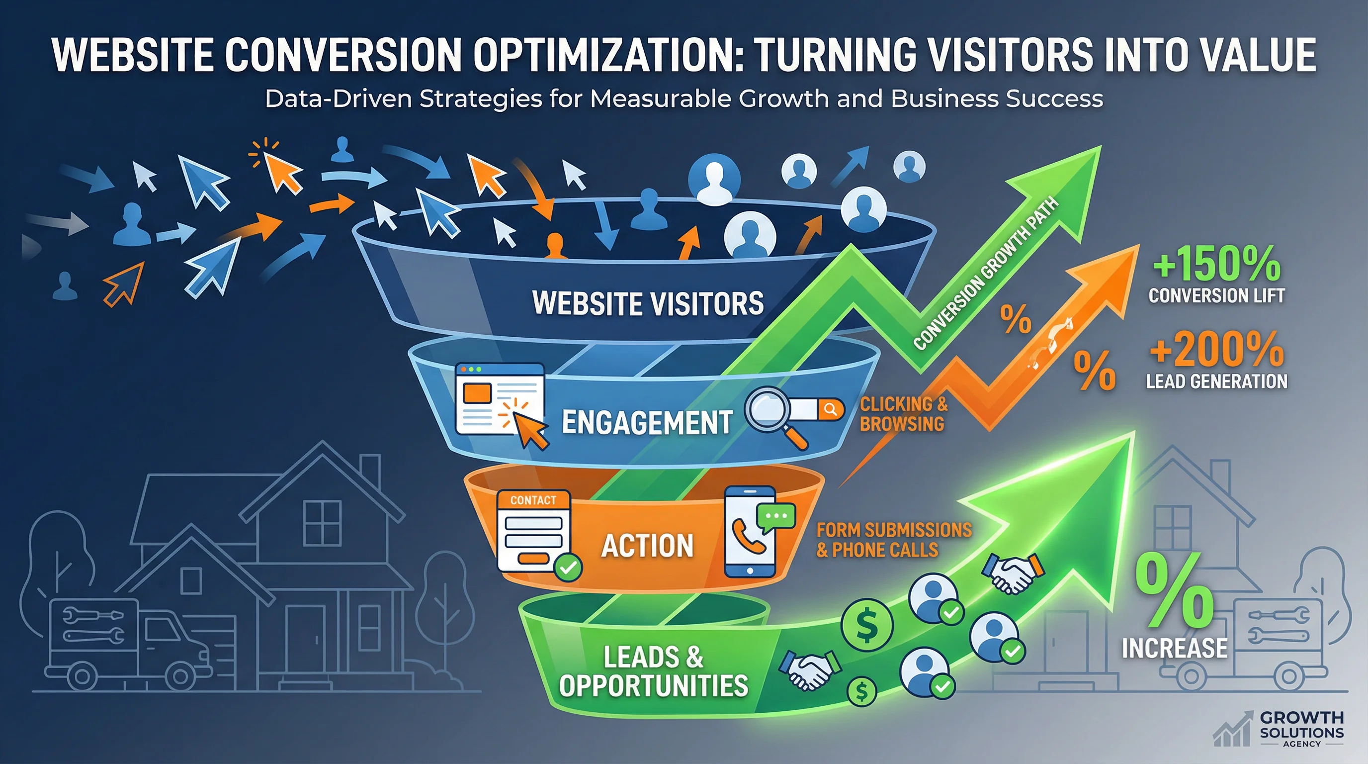
The hard truth: Most contractor websites convert at 1-3%. That means for every 100 visitors, only 1-3 become leads. High-performing contractor sites convert at 5-10% or higher.
The math: If you are getting 1,000 visitors per month at 2% conversion, that is 20 leads. Increase conversion to 6%, and you get 60 leads—3x more leads from the same traffic.
This is why conversion optimization is the highest-ROI marketing activity you can do. You have already paid for the traffic. Now make it count.
The 12 Conversion Secrets That Actually Work
1. Lead with a Clear Value Proposition (Above the Fold)
The mistake: Generic headlines like "Welcome to ABC Plumbing" or "Quality Service Since 1995"
The fix: Tell visitors exactly what you do and why they should choose you in the first 3 seconds.
Examples:
- "Same-Day HVAC Repair in Fresno | 20+ Years, 4.9 Stars, Licensed & Insured"
- "Emergency Plumbing 24/7 | We Answer in 60 Seconds or Less"
- "Roof Replacement with $0 Down Financing | Free Estimate in 24 Hours"
Why it works: Homeowners scan your site in seconds. If they cannot immediately tell you serve their area, offer their needed service, and are credible, they bounce.
2. Make Your Phone Number Impossible to Miss
The mistake: Tiny phone number in the footer, or worse, hidden in a "Contact Us" page
The fix:
- Large, clickable phone number in the header (with tel: link for mobile)
- Sticky call button that follows users as they scroll
- Repeat the number in the hero section and after every service description
Why it works: For emergency services (plumbing leaks, AC failures, roof damage), homeowners want to call NOW. Make it effortless.
Bonus: Use a call tracking number (CallRail, CallTrackingMetrics) to measure which pages and campaigns drive calls.
3. Use Multiple CTAs (Not Just One)
The mistake: One "Contact Us" button at the bottom of the page
The fix: Offer multiple ways to convert at multiple points on the page:
- Call button (for people who want to talk now)
- "Book Online" button (for people who prefer self-service)
- "Get a Free Estimate" form (for people researching options)
- "Text Us" button (for people who hate phone calls)
Why it works: Different people prefer different communication methods. Give them options.
Pro tip: Place a CTA every 1-2 scrolls. If someone has to hunt for how to contact you, they will leave.
4. Show Social Proof Immediately
The mistake: Reviews are buried on a separate page or not shown at all
The fix: Display star ratings, review count, and testimonials prominently on the homepage.
Examples:
- "4.9 Stars from 247 Google Reviews"
- "Trusted by 1,200+ Fresno Homeowners"
- "Inc. 5000 Fastest-Growing Company 4 Years in a Row"
Where to place it:
- Header (next to your logo or phone number)
- Hero section (right below your headline)
- Testimonial section (with photos and full names for credibility)
Why it works: Homeowners do not know you. Social proof = instant credibility.
5. Add Urgency (Without Being Sleazy)
The mistake: No reason to act now, so visitors say "I will think about it" and never return
The fix: Give them a real, honest reason to act today:
- "Same-day service available (if you call before 2 PM)"
- "Free estimates this week only"
- "Limited financing slots available for March"
- "Emergency service—we answer 24/7"
Why it works: People procrastinate. Urgency creates a reason to act now instead of later.
Warning: Do not use fake urgency ("Only 2 spots left!") if it is not true. Homeowners can smell BS, and it destroys trust.
6. Simplify Your Forms (Fewer Fields = More Leads)
The mistake: Forms that ask for 10+ fields (name, email, phone, address, service type, preferred date, time, budget, how did you hear about us, etc.)
The fix: Ask for 3 fields max on the initial form:
- Name
- Phone number
- Service needed (dropdown)
Why it works: Every additional form field reduces conversions by 5-10%. Get the minimum info needed to follow up, then ask the rest on the phone.
Pro tip: Use conditional logic to show additional fields only if needed (e.g., if they select "Emergency Repair," ask "When did this start?").
7. Mobile Optimization is Non-Negotiable
The mistake: Site looks great on desktop but is a disaster on mobile
The fix:
- Responsive design that adapts to all screen sizes
- Large tap targets (buttons at least 44x44 pixels)
- Readable text (minimum 16px font size)
- Fast load times (under 2.5 seconds)
- Click-to-call buttons (no manual dialing)
Why it works: 60-70% of contractor website traffic is mobile. If your mobile experience sucks, you lose the majority of your leads.
Test: Open your site on your phone right now. Is it easy to use? If not, fix it today.
8. Use Video to Build Trust Fast
The mistake: Text-only site with stock photos
The fix: Add real videos of your team, your work, and your customers:
- 30-60 second intro video on the homepage (founder or lead tech explaining your process)
- Before/after project videos showing real jobs
- Customer testimonial videos (even smartphone quality works)
Why it works: Video builds trust 10x faster than text. Homeowners want to see who will show up at their house.
Pro tip: Host videos on YouTube (for SEO) and embed them on your site. YouTube videos also rank in Google search results.
9. Highlight Financing (Especially for Big Jobs)
The mistake: No mention of financing, or it is buried in fine print
The fix:
- Financing badge in the header ("$0 Down, 0% APR for 12 Months")
- Dedicated financing page explaining options
- CTA buttons that say "Check Your Rate in 60 Seconds"
Why it works: High-ticket jobs (HVAC replacements, roof installs, remodels) require financing for most homeowners. If you do not mention it, they assume you do not offer it.
Impact: Contractors who prominently display financing see 20-40% higher conversion rates on replacement jobs.
10. Answer Objections Before They Arise
The mistake: Visitors have questions but cannot find answers, so they leave
The fix: Add an FAQ section that addresses common objections:
- "How much does [service] cost?" (Give a range)
- "Do you offer emergency service?" (Yes, 24/7)
- "Are you licensed and insured?" (Yes, here are our credentials)
- "What areas do you serve?" (List cities)
- "Do you offer financing?" (Yes, multiple options)
- "How quickly can you get here?" (Same-day or next-day)
Why it works: Every unanswered question is a reason to leave your site and check a competitor.
11. Use Exit-Intent Popups (Last Chance to Convert)
The mistake: Visitors leave without taking action, and you never hear from them again
The fix: Trigger a popup when they are about to leave offering:
- "Wait! Get a Free Estimate Before You Go"
- "Download Our Free Contractor Checklist"
- "Text Us Your Question—We Respond in 5 Minutes"
Why it works: Exit-intent popups convert at 2-4%, meaning you capture leads who would have otherwise been lost.
Pro tip: Do not use aggressive popups that appear immediately. Only trigger them when the user moves their mouse toward the back button or close tab.
12. A/B Test Everything
The mistake: Guessing what works instead of testing
The fix: Run A/B tests on:
- Headlines
- CTA button text ("Call Now" vs. "Get a Free Estimate")
- CTA button color (orange vs. green vs. red)
- Form length (3 fields vs. 5 fields)
- Social proof placement (header vs. hero section)
Why it works: Small changes can have massive impact. A better headline or CTA button can increase conversions by 20-50%.
Tools: Google Optimize (free), Optimizely, VWO
Real-World Example: Before & After
Before:
- Generic headline: "Welcome to ABC Plumbing"
- Phone number in footer only
- One "Contact Us" button at the bottom
- No reviews displayed
- 7-field contact form
- Mobile site slow and hard to use
- Conversion rate: 1.8%
After:
- Clear headline: "Emergency Plumbing 24/7 in Fresno | 4.9 Stars, Licensed & Insured"
- Sticky call button + click-to-call in header
- Multiple CTAs (call, text, book online)
- Star rating and review count in hero section
- 3-field form (name, phone, service)
- Mobile-optimized, loads in 1.9 seconds
- Conversion rate: 6.2%
Result: 3.4x more leads from the same traffic.
How to Prioritize These Changes
If you are overwhelmed, start here:
Quick wins (do this week):
- Add a clear value proposition to your homepage
- Make your phone number huge and clickable
- Add star ratings to your header
- Simplify your contact form to 3 fields
Medium effort (do this month): 5. Add multiple CTAs throughout your site 6. Create an FAQ section 7. Add urgency messaging (same-day service, limited slots, etc.) 8. Optimize for mobile
Long-term (do this quarter): 9. Add video (team intro, testimonials, before/after) 10. Set up A/B testing 11. Add exit-intent popups 12. Highlight financing options
The Bottom Line
More traffic is not the answer. Better conversion is.
By implementing these 12 tactics, you can double or triple your leads without spending another dollar on ads. The best part? These are one-time fixes that keep working month after month.
Ready to audit your website? Go through this checklist and identify your biggest conversion leaks. Then fix them one by one, starting with the quick wins.
Ready to Build a High-Converting Contractor Website?
At Sequoia GEO, we specialize in building websites that turn visitors into booked jobs. From conversion-optimized design to A/B testing and analytics, we handle the details so you can focus on growing your business.
Let's talk about increasing your website conversions. Schedule a free consultation today.
Related Articles
10 Must-Have Website Features for Contractors in 2026
In 2026, contractor websites must go beyond looking good—they need to convert visitors into booked jobs.
Modern Contractor Website Design: What Works in 2026
Modern contractor websites prioritize speed, mobile-first design, trust signals, and conversion optimization.
HVAC GEO: How to Engineer Your Air Conditioning Business for the AI Era
How AI is changing HVAC marketing. GEO strategies to stay visible in ChatGPT, Google AI Overviews & voice search.'Google Search' era is ending. If your HVAC business isn't built to answer the complex questions homeowners are asking AI, you aren't just losing clicks—you're being erased. Learn the four pillars of HVAC GEO.
Ready to Grow Your Contractor Business?
Let's apply these strategies to your business. Get a free analysis of your current marketing and a custom growth plan.